Computer Game Logo Design
Share
COMPUTER GAME LOGO DESIGN
I had never intended to involve myself in computer game logos or the games themselves. In fact, my son Yendor had a few early games that he played on second-hand devices given to him by our relative Guy, who at that time worked for IBM, and I thought the whole thing abysmally inappropriate for any kind of worthwhile artwork. The nearest I got to the genre was to while away a couple of hours thrashing the "Astro Wars" table at my local pub!
Time passed though and the games, even though still quite crude in terms of graphics, started to sell in increasingly elaborate boxes with some nicely printed illustrated covers ...
In 1987 I was commissioned by American computer game developer and publisher The Edge to design their company logo. I show here for the first time the full range of drawings that were under consideration. Obviously, the colour image was the one settled for.

PROPOSED LOGO DESIGNS FOR THE EDGE (PENCIL ON TRACING PAPER) AND THE CHOSEN DESIGN (PIGMENTED INKS ON ART PAPER)
Not a logo this time, but in 1988 I received a phone call from British computer game publisher Software Communications (later Martech Games), appealing in a hurry for a dual-purpose image for their soon to be released arcade-style racing game ‘The Fury’. The image was required quickly for a press ad and was also used as the game box cover art. Such was their deadline, that with some furious work, I completed the image in three days!
 THE FURY (PIGMENTED INKS ON ART BOARD) AND AS IT APPEARED ON THE GAME BOX COVER (IMAGE CREDIT: https://www.mobygames.com/game/fury__/cover-art/gameCoverId,398127/)
As far as I can remember, nothing much happened again for me in this arena until 1993, when I was approached by Silmarils, a French computer game software company, who produced games for PC, Amiga, Amstrad CPC, Macintosh, Atari ST and Atari Falcon. They wanted to licence my image 'The Heavy Metal Hero' for use as the game box cover art for their sci-fi, post-apocalyptic themed, strategic trading and combat game 'Transarctica'.
 THE HEAVY METAL HERO (PIGMENTED INKS ON ART BOARD) AND AS IT APPEARED ON THE GAME BOX COVER (IMAGE CREDIT: https://www.mobygames.com/game/arctic-baron/cover-art/gameCoverId,59033/)
Then, around 1994, a young man named Jon Burton came up to my signing table at the Crossfire Music Festival in Liverpool and, after buying a pile of my posters, mumbled something about having a small games company needing a logo design. I thanked him for his interest and agreed to do the job, but quickly forgot about the request, until months later, when his partner, in what turned out to be Traveller Tales, got in touch to outline requirements.
I got scribbling some ideas with the understanding that I had been commissioned by a company producing games for a young age group – hence the little, long-eared critter that spoke to me of adventure and travel. I am showing here the full range of pencil drawings I proposed to Burton and Andy Ingram. I was asked for two logos. Something that looked a little "olde worlde" for Travellers Tales, and a second related image for an arm of their company that had more futuristic aspirations – Tales 2 or Tales Squared.
 PROPOSED LOGO DESIGNS FOR TRAVELLER'S TALES (PENCIL ON TRACING PAPER)
 PROPOSED LOGO DESIGNS FOR TALES 2 (PENCIL ON TRACING PAPER)
 THE CHOSEN DESIGNS FOR TRAVELLER'S TALES AND TALES 2 (PIGMENTED INK ON ART BOARD)
The same critter and the circular moon/planet were featured on both chosen designs to keep continuity between both companies. Things later changed within the company and I don’t recall seeing the Tales 2 logo appearing anywhere other than a letterhead. The "olde worlde" version however, went on to adorn many millions of game boxes, advertisements, etc, until it was finally replaced by a couple of dull-looking "T's".
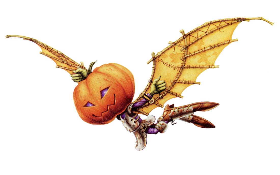
In 1996, Liverpool based games company Bizarre Creations, also asked me for a company logo. It had to include a pumpkin headed character or at least reflect their original pumpkin logo in some way. There was some back and forth footwork between my studio and Bizarre, where I debated the design with Martyn Chudley. Here are some of the proposed ideas.
 PROPOSED LOGO DESIGNS FOR BIZARRE CREATIONS (PENCIL ON TRACING PAPER)
Finally we agreed on the colour version seen here with the Pumpkin guy aloft on homemade parchment wings.
BIZARRE CREATIONS LOGO (PIGMENTED INKS ON ART BOARD)
A while later – just after a commission to design a ‘Doctor Who’ game had come to nothing (it always did with DW), Jon Burton of TT asked for my involvement in his new game idea to be titled ‘Paradise Dawn’.
“Can I have a few very rough logo ideas” he asked.
Here are said ideas, that were never developed, on the grounds that the game title was changed to ‘Haven – The Call of the King’, which I will tell of in a later blog!
 ROUGH LOGO PENCIL SKETCHES FOR PROPOSED GAME 'PARADISE DAWN'
Many years ensued, in which Travellers Tales grew into a mighty games company under the guidance of Jon Burton who eventually sold it to Warner Bros. Jon Burton was not seen on my radar until last year, when, after a bit of catch-up chit-chat, he asked me to design a logo for his GameHut website. This appears to be Jon lamenting the passing of the old days? His website states:
"After 29 years as director of Traveller’s Tales/Tt Games, he thought it was time to share some behind-the-scenes looks at game development."
The GameHut logo had to have a similar feel to my original Traveller’s Tales logo and incorporate the same long-eared, stripy critter. It’s all come a full circle! Here are the preliminary sketches and logo.
 FIRST ATTEMPTS AT THE GAMEHUT LOGO (PENCIL ON TRACING PAPER)
 THE CHOSEN GAMEHUT LOGO DESIGN (PENCIL ON TRACING PAPER) AND THE FULL COLOUR PAINTING (PIGMENTED INKS ON ART BOARD)
Click "play" below to see a time-lapse video of this logo coming to life.
Thank you for reading. There will be more computer game blogs to come, focussing on conceptual design, starting with SOS Dark Planet, which was transformed into Shadow Master. Before that however, I will be blogging once more on one of my favourite subjects - insects! Come back next week - Sunday, 2nd June at 7pm - for Insect Antics Part III.
All the best
Rodney

 THE FURY (PIGMENTED INKS ON ART BOARD) AND AS IT APPEARED ON THE GAME BOX COVER (IMAGE CREDIT:
  THE HEAVY METAL HERO (PIGMENTED INKS ON ART BOARD) AND AS IT APPEARED ON THE GAME BOX COVER (IMAGE CREDIT:
  PROPOSED LOGO DESIGNS FOR TRAVELLER'S TALES (PENCIL ON TRACING PAPER)
 PROPOSED LOGO DESIGNS FOR TALES 2 (PENCIL ON TRACING PAPER)
 THE CHOSEN DESIGNS FOR TRAVELLER'S TALES AND TALES 2 (PIGMENTED INK ON ART BOARD)
 PROPOSED LOGO DESIGNS FOR BIZARRE CREATIONS (PENCIL ON TRACING PAPER)

 ROUGH LOGO PENCIL SKETCHES FOR PROPOSED GAME 'PARADISE DAWN'
 FIRST ATTEMPTS AT THE GAMEHUT LOGO (PENCIL ON TRACING PAPER)
 THE CHOSEN GAMEHUT LOGO DESIGN (PENCIL ON TRACING PAPER) AND THE FULL COLOUR PAINTING (PIGMENTED INKS ON ART BOARD)
1 comment
These are brilliant Rodney, in many ways I prefer them to a number of your more developed works, less to take in, more to see. The Travellers Tales and Bizarre ones especially, they would make great starting illustrations for children’s books.